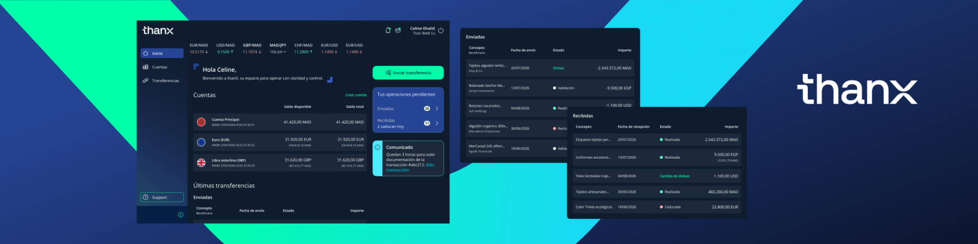
In Morocco, SMEs that want to import or export goods have to run a three-stop obstacle course for every transaction. First they go to Portnet to file the paperwork their import or export requires. Then they visit a FX house to convert the money they want to move. Finally, they walk into a bank to actually execute the transfer. Three institutions, three trips, three points of friction, for a single cross-border payment.
The solution
CaixaBank already had a foothold in Morocco, mainly serving large corporations, but through a platform that wasn't pulling its weight. The goal was to redesign that desktop platform on top of CaixaBank's existing platform backend, so it could serve both imports and exports and work for large companies and SMEs alike. The redesigned product brings the whole journey into one place: it simplifies transfers abroad and domestically, folds in Portnet's requirements, and stays aligned with the country's regulations, turning that three-stop errand into a single guided flow.
Timeline
Apr 2025 – Present
The team
Cala Largacha – Product & UX Designer
Eggs / Sopra Steria design team
Sopra Steria Front-end engineering
CaixaBank Morocco business stakeholders
Project timeline
Apr 2025
Benchmark and analysis
May 2025
Information architecture and wireframes
Late Jun 2025
Typography and color direction
Jun–Jul 2025
CaixaBank design system adaptation
Jul 2025
First user testing round
Jul–Sep 2025
Import and export flows
Sep 2025
Login and support flows
Oct–Nov 2025
Transfers and currency exchange
Dec 2025–Feb 2026
Testing adjustments
Feb–Jun 2026
Documentation and flow refinement
Jul 2026
MVP2 launch
Jul 2026–Present
MVP2 improvements
thanX – CaixaBank — key screens.
How might we turn a three-stop errand into a single guided flow?
CaixaBank Morocco needed an FX experience their SME clients could trust without a relationship manager on the line. We rebuilt the journey around transparency: one price, one timeline, one flow.
🏢 Business problem
CaixaBank had a foothold in Morocco mainly serving large corporations, but its platform wasn't pulling its weight. There was an opportunity to redesign the experience so it could serve both large companies and SMEs, and handle imports, exports and transfers in one place.
👤 User problem
SMEs importing or exporting goods had to visit Portnet, an FX house and a bank for every transaction — a three-stop obstacle course with three points of friction for a single cross-border payment.
Three institutions, three trips for every cross-border paymentA single guided flow for imports, exports and transfers
🎯 My role
I led the timeline from the UX side and worked hands-on as a UX/UI designer — running research and facilitating sessions with the business and technology teams to land a product we could realistically build and genuinely wanted to create, given both the needs and the deadlines.
•Led the UX timeline and worked hands-on as a UX/UI designer
•Ran research and facilitated sessions with business and technology teams
•Took ownership of the transfer and currency-exchange flows
•Spotted where the experience could break and resolved it through support or design adjustments
•Stayed in constant contact with development and business to reach the same finish line
User research
Making sense of what was already there
By the time I joined, a first round of interviews had already been run and the business team had gathered a solid base of information. My job was to make sense of it: I analyzed what was there and ran a benchmark of comparable platforms to understand what good looked like and where the opportunities were.
thanX research synthesis boardDrop image here
Journey map
Architecture & journey map
With that foundation, we built the platform's core architecture and mapped the first journeys alongside business and technology. Those maps translated into lo-fi flows, which we then tested with users — a way to learn how to design each flow efficiently, simplify the experience, and stay honest about the technical limitations we were working within.
thanX architecture and journey mapDrop image here
Design + iterations
Design & iterations
Once the branding agency delivered the colors, the work became about adaptation — applying solid design principles and accessibility standards, with the added constraint that the client wanted this first version presented in dark mode. Building on CaixaBank's design system and identifying which components mattered most, we adapted the color palette and the platform's design to fit the new brand without losing consistency.
thanX design iterationsDrop image here
Outcomes and impact
The platform is live. Users are now moving goods and services across currencies in a single outbound flow, and receiving SWIFT payments distributed straight into their accounts, with the currency exchange handled inside the same platform, no third stop required. We continue to add tools and improvements on an ongoing basis.
Personal reflection
This project taught me how to coordinate across different product teams, sharpening how I communicate and looking for efficiency in the way we worked with development. It also taught me how to hold the objective steady through change: when leadership shifted on the business side, keeping everyone anchored to the same goal became part of my job, and I learned to be the thread of continuity when the context around the project moved.
Want the full walkthrough?
Happy to walk you through the research, the iterations and the final screens in detail.